Brand Development- Week 3 Part B

The development of Ami Campbell Art began about six years ago when I was starting my sophomore year of my Fine Arts degree at MiraCosta. I wanted to start selling my artwork through Etsy and I had a few prints that other people were interested in. The name of my first shop was Art Krit Chic because I wanted to come up with a logo that incorporated my initials; AKC. About two years later, I had sold a few prints, but not too many, and I wasn't really trying to sell after my first approach to Etsy, but after I moved to the San Francisco Bay area, I was introduced to arts and crafts fairs through some friends. I was invited to display some of my work at their booth, but I wanted to get business cards situated. The name of my art shop then turned from Art Krit Chic to Ami Campbell Art and from there, I have slowly been able to improve the quality of my brand.
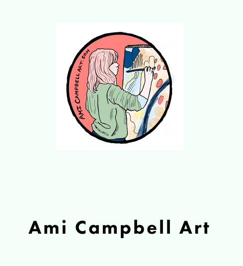
I created the logo for my shop about 2 years ago. I took a photo of myself painting on canvas and illustrated it. I have not placed a tagline into the imagery of my logo. The logo makes it very apparent that Ami Campbell Art is run by a small pink haired woman painter. It placed me at the front of the brand, or at least it places a caricature of myself. My name is Amanda in real life, but Ami as "the Artist." I just feel like the name Amanda Campbell didn't ring "artist"the way I wish it did. Ami is a shortened nickname of mine. Pronounced "Ah-meee."
The color scheme I have used for my logo is the complimentary but muted tints of reds and greens. I would say the red is more of a pink tone, but it is a lot warmer in appearence, than a magenta pink is. I based the colors on my hair because my customers know me for it. I used to work at a coffee shop and through that shop, I would sell a lot of my artwork. My partner, Elaine (an artist as well...) also worked there, so to differentiate us, our customers would regard to us as the one with the pink hair versus the one with the black hair.
The font I used for the logo is my own handwriting. I wanted to give it more of a home-y vibe, and I wanted it to feel like the art was very local, which it is. I am thinking though, of going back into illustrator and redesigning the logo. The handwritten font doesn't seem to be working out as I had planned. It is kind of hard to read, and doesn't look as clean cut as I want it to be now. I've grown since I last designed it, so I think I want to look into a redesign.
All of my promotional work features the logo. I have run booths at craft fairs, and made flyers to promote my booth, along with stickers and business cards to have at my booth. Everyone liked the stickers I made. I completely ran out of them by the end of the day. My regulars would definitely recognize my brand, but I don't think new, potential customers would recognize it. The way I've marketed in the past was through regulars at my coffee shop. I feel scared now that I do not have that base. I am going to have to work a lot harder for my brand recognition to be stronger, so that people will recognize me through online promotions.

Comments
Post a Comment